Building a Customizable Glassmorphism Component with React and TypeScript
Overview
Glassmorphism is a modern UI design trend that creates the illusion of a translucent, glass-like surface. This effect relies on background blurring, subtle borders, and multi-layered transparency to establish visual hierarchy. In this tutorial, we move beyond basic CSS by building a reusable, highly customizable component using React and Material-UI. We will focus on making the visual parameters—like color and blur intensity—dynamic through TypeScript interfaces, ensuring the component is both beautiful and type-safe.
Prerequisites
To follow along, you should have a baseline understanding of React functional components and hooks. We will use TypeScript for prop definitions, so familiarity with interfaces is helpful. You should also have a basic grasp of CSS concepts like linear gradients and filters.
Key Libraries & Tools
- Material-UI (MUI): Provides the
Boxcomponent and theuseStyleshook for styling. - Color: A utility library used to manipulate transparency and color values dynamically.
- clsx: A tiny utility for constructing
classNamestrings conditionally. - TypeScript: Provides static typing to ensure props like
blurorcolorare used correctly.
Code Walkthrough
Defining the Component Base
We start by wrapping the Material-UI Box component. By extending BoxProps, our GlassCard inherits standard layout properties like padding and margin.
interface GlassCardProps extends BoxProps {
  color?: string;
  blur?: number;
  noBorders?: boolean;
  square?: boolean;
}

const GlassCard: React.FC<GlassCardProps> = ({ children, color = 'white', blur = 7, ...props }) => {
  const classes = useStyles({ color, blur });
  return <Box className={classes.glass} {...props}>{children}</Box>;
};
Implementing the Glass Style
The magic happens in the useStyles hook. We use a combination of rgba backgrounds and the backdropFilter property. To make the color dynamic, we use the color library to adjust alpha channels on the fly.
const useStyles = makeStyles((theme) => ({
  glass: {
    background: (props) => Color(props.color).alpha(0.2).toString(),
    backdropFilter: (props) => `blur(${props.blur}px)`,
    backgroundImage: (props) => `linear-gradient(to bottom right,
      ${Color(props.color).alpha(0.3).toString()},
      ${Color(props.color).alpha(0).toString()})`,
    border: '1px solid rgba(255, 255, 255, 0.3)',
    boxShadow: '0 8px 32px 0 rgba(31, 38, 135, 0.37)',
  },
}));
Adding Cascading Motion
To create a "slick" feel, we can animate the entry of child elements. By using React.Children.map, we wrap each child in a Grow transition with an incrementing timeout.
{React.Children.map(children, (child, index) => (
  React.isValidElement(child) ? (
    <Grow in timeout={(index + 1) * 200}>
      <div>{child}</div>
    </Grow>
  ) : null
))}
Syntax Notes
Notice the use of string interpolation within the JSS object. This allows us to inject TypeScript props directly into CSS values. We also utilize the spread operator (...props) to ensure that any standard Material-UI attributes passed to our component are forwarded to the underlying Box element.
Practical Examples
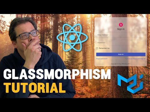
This effect is most effective on Authentication Screens or Landing Page Cards where you want to "reel in" users with high-end visuals. It works best over high-contrast, colorful background images where the blur effect is clearly visible.
Tips & Gotchas
- Performance: Extensive use of
backdrop-filtercan be resource-heavy on older mobile devices. Use it sparingly. - Readability: Always test your text contrast. If the glass is too transparent, the text might become unreadable against a busy background.
- Dark Mode: Glassmorphism often looks "muddy" in dark mode; it generally performs better in light mode with bright, vibrant backgrounds.
- Material-UI
- 23%· products
- React
- 23%· products
- TypeScript
- 23%· products
- CSS
- 15%· products
- clsx
- 8%· products
- color
- 8%· products
Build a GLASSMORPHISM React Component - Typescript & Material-UI
WatchArjanCodes // 19:03

On this channel, I post videos about programming and software design to help you take your coding skills to the next level. I'm an entrepreneur and a university lecturer in computer science, with more than 20 years of experience in software development and design. If you're a software developer and you want to improve your development skills, and learn more about programming in general, make sure to subscribe for helpful videos. I post a video here every Friday. If you have any suggestion for a topic you'd like me to cover, just leave a comment on any of my videos and I'll take it under consideration. Thanks for watching!